Update App Icon (More Contrast & Standout)
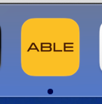
The current app icon lacks contrast and doesn’t stand out well among other apps in the dock or taskbar. This makes it harder to quickly recognize ABLE, especially when multitasking.
Expected
Refresh the app icon design with higher contrast.
Ensure it is distinct and recognizable in both light and dark modes.
Keep visual consistency with ABLE’s brand identity.
Status: Rejected
Log in to comment and vote
No comments yet
Be the first to share your thoughts.